After 7 years, it was time to migrate my old Jekyll website to a new more modern platform. Read on to learn why, how, and what the main challenges were in this process.
Before#
My old website was built using Jekyll with the minimal mistakes theme. I mainly chose Jekyll, because it could be hosted directly on Github. However, I soon realized Github (at the time) only supported a few Jekyll plugins and hence I had to get creative.
Given I wasn’t familiar with web development, I ended up compiling the code locally and pushing the result. 😬 To make this all work, I placed all source code into a jekyll-code subfolder and added two helper scripts:
- release would generate all HTML/CSS and copy it to the root folder
- deploy would push the code and clear the CDN cache using their API.
Let’s file this under fake it till you make it, not pretty, but it got the job done.
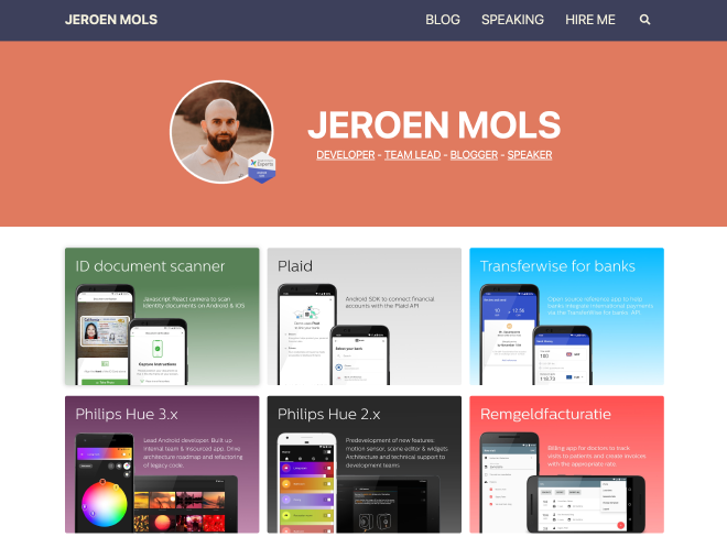
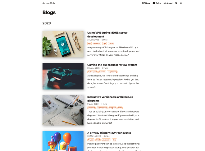
Here’s how my website looked:
Challenges#
Besides the incredibly obvious committing compiled code to Git, my old website had several challenges:
- Poor reading experience due to large fonts and narrow paragraphs
- Slow page loads, even me manually optimizing every image using ImageOptim
- Unable to request feedback on draft articles, due to missing “staging” environment
- Subpar developer experience: slow compilation, issues with installing Ruby gems, and a slow down in development
- Outdated design and missing dark mode
But did I need a new website? Of course not! Yet, given that I’m doing full stack development nowadays, it was an excellent excuse to allow myself to be nerd sniped.
Hey Hugo 👋#
As my next blogging platform, I wanted to stick to a static site generator due to the speed benefits and ability to write posts in markdown. There are three frameworks I briefly considered: Astro, 11ty, and hugo. But I quickly settled for Hugo since it has the most Github stars and is under active development.
Besides being super fast to compile, Hugo also offers image processing pipelines to resize/convert my images automatically. This is huge, as I had to resize and optimize each image manually using ImageOptim.
Hugo also has a concept of shortcodes making it very easy to write reusable components. The theme I decided to use is Blowfish because it’s feature-rich and actively maintained by Nuno Coração.
To host my website, I looked at both Vercel and Netlify. After reading this excellent comparison article, I settled on Netlify since their analytics offering is server-side and therefore more anonymous.
Full disclosure, I’m not using any analytics currently, but if I ever would, anonymous server side (e.g. page downloads) will be the way to go.
I’m quite impressed so far with how smooth Netlify has been. Not only is my broken release process fixed, but I now even have build previews for my pull requests!
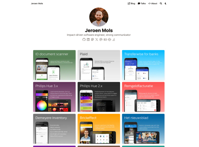
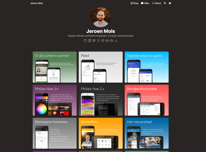
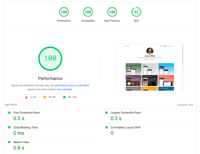
Behold, my new clean information-dense website:
And it even supports dark mode!
Migration notes#
While I don’t want to bother you with all migration details, you may be interested in:
- using LLMs as a migration tool
- not breaking existing links
- speeding up the homepage
Using LLMs as a migration tool#
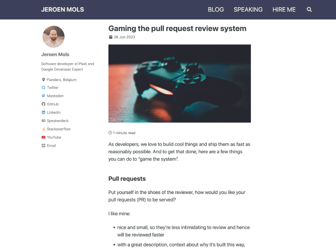
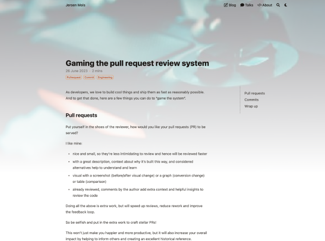
Both Jekyll and Hugo use different conventions to organize content. Take for instance my post on Gaming the pull request review system:
In Jekyll the article and corresponding cover image were located in different folders:
blog/_post/2023-07-24-vpn-development.md
img/blog/prs-and-commits/cover.jpg
Whereas in Hugo, both the article and the images should be colocated together and follow different naming conventions:
content/blog/073-prs-and-commits/index.md
content/blog/073-prs-and-commits/featured.jpg
The markdown file of each article also has a header of Front matter:
---
title: Gaming the pull request review system
published: true
header:
  teaser: img/blog/prs-and-commits/cover.jpg
  imgcredit: Photo by Alexey Savchenko on Unsplash, https://unsplash.com/photos/k4Akpt5-Sfk, cropped and resized
tags:
 - pullrequest
 - commit
 - engineering
---
To migrate to Hugo I had to modify and add of few attributes:
- a
datesince that’s no longer encoded in the file name - a
slugto ensure my hyperlinks don’t break (see further) - a
featureimagecaptionto show image attribution on all images
---
title: Gaming the pull request review system
published: true
tags:
- pullrequest
- commit
- engineering
date: '2023-06-26'
slug: prs-and-commits
featureimagecaption: Photo by Alexey Savchenko on Unsplash, https://unsplash.com/photos/k4Akpt5-Sfk,
 cropped and resized
---
Reorganizing, renaming, and changing the Front matter on all my 74 blog posts is a lot of work. But it’s also repetitive, and hence an excellent use case to ask an LLM (ChatGPT) to write a migration script!
Here’s my prompt to give you an idea of the workflow I used. After this initial prompt, I requested some follow-up modifications and also made some modifications myself that I fed back to ChatGPT.
I’m migrating a blog from Jekyll to Hugo, can you write me a Ruby script that transforms the old blog posts to the new format?
All old blog posts are placed in
jekyll-code/blog/_posts/and have a file name in the following format:yyyy-mm-dd-<post-name>.md(for example2020-02-19-year-in-review.md). Each post starts with a front matter that contains atitle,header, andtagselement. Theheaderelement consists out of ateaserandimgcredit.For instance:
---
title: Year in review 2019
header:
teaser: img/blog/yearinreview19/yearinreview19.jpg
imgcredit: Photo by cottonbro from pexels, http://www.pexels.com/photo/blue-and-black-audio-mixer/, cropped and resized
tags:
- android
- library
---
This is what the ruby script should do:
- for every blog post in
blog/_posts/- it should grab the
<post-name>from the filename and create a new folder inoutputcalledpost-name- it should move the blog post to that folder and rename it to
_index.md- it should add element
dateto the front matter containing the date scraped from the file name.date: yyyy-mm-dd
- it should read the teaser tag and move the image at that location to the new folder and rename it to
teaserwhile keeping the extension- it should also copy all other images that are in the folder where the teaser image originally was to the new folder
- it should parse the imgcredit tag and if it contains a hyperlink, add that to a
to-download.csvcsv file in theoutputdirectory. The entry should > contain both the URL and the path to the new directory.
This resulted in the following, but rather bespoke migration script.
Using chatGPT, I ended up writing three such scripts:
- one to migrate all the files and update their front matter
- one to add image credits to all images
- one to replace
<img>tags with markdown figures
This allowed me to automate 90% of the migration. I still ended up doing a quick manual pass over all files to fix all remaining issues and to make the source code more idiomatic.
Not breaking existing links#
Since I’ve been blogging for nearly 10 years now, there are quite some websites that refer to some of my content. The last thing in the world I would want is to break those links.
Therefore I took extra care in ensuring that all my blog links were the same before/after. I accomplished this by adding a slug tag to the front matter of all of my previous blog posts and configuring Hugo to use my old permalink structure:
#config/default/hugo.toml

[permalinks]
 [permalinks.page]
 blog = '/blog/:year/:month/:day/:slugorfilename/'
Next, I also wrote a script to compare the sitemap.xml of the old against the new website:
grep loc ../sitemap.xml > old.txt
grep loc public/sitemap.xml > new.txt
sort old.txt > old_sorted.txt
sort new.txt > new_sorted.txt
git diff --no-index --color --ignore-all-space new_sorted.txt old_sorted.txt
This allowed me to verify that my new website was backward compatible.
One thing I didn’t care about is making my RSS feed backwards compatible as I decided it wasn’t worth the effort. Should you want to resubscribe, here’s the new link.
Speeding up the homepage#
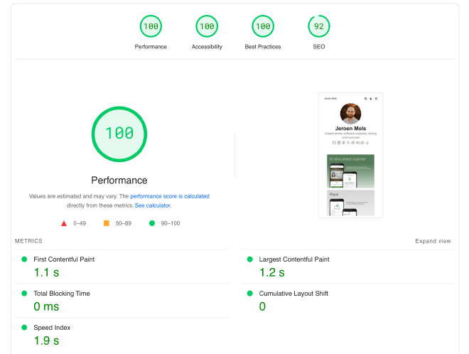
The key challenge I had in making my website snappy and look sharp was optimizing my portfolio on my homepage.
Unfortunately, the built-in gallery shortcode only loads images in a single size: thumbnail or expanded. And I did want my page to load super fast and have a higher resolution version to allow users to zoom in.
After a lot of experimentation, I decided to roll my own Gallery component using a bit of CSS to render the images in different grid sizes across different screens.
<style>
  /* Gallery Grid */
  .gallery-container {
    display: grid;
    grid-template-columns: 1fr;
    gap: 15px;
    max-width: 1000px;
    margin: 0 auto;
 }

  .gallery-item img {
    width: 100%;
    height: auto;
    object-fit: cover;
    border-radius: 5px;
    box-shadow: 0 4px 8px rgba(0, 0, 0, 0.1);
    cursor: pointer;
    transition: transform 0.3s ease;
    margin: 0px;
 }

  .gallery-item img:hover {
    transform: scale(1.05);
 }

  @media (min-width: 600px) {
    .gallery-container {
      grid-template-columns: repeat(2, 1fr);
 }
 }

  @media (min-width: 800px) {
    .gallery-container {
      grid-template-columns: repeat(3, 1fr);
 }
 }
</style>
To render the images themselves, I built my own portfolio-figure shortcode which is a fork of Blowfish’s built-in figure shortcode.
<img
  class="my-0 rounded-md{{ with $nozoom }} nozoom{{ end }}{{ with $class }} {{ . }}{{ end }}"
  src="{{ (.Resize "320x webp").RelPermalink }}"
  alt="{{ $altText }}"
  width="512px"
  height="362px"
  data-zoom-src="{{ (.Resize "2048x webp").RelPermalink }}"
/>
It has a few notable tweaks to increase the loading performance:
- resizes the image to 320px by
- set the downscaling algorithm to Lanczos, to get sharper text
- changes the image type to webp
- set a width and height, to avoid layout shifts while the images are being loaded
- set a
data-zoom-srcwhich tells medium-zoom to load a larger image on expanding
I’m pretty proud of the results! 😎
Wrap up#
I’m happy with how my website redesign turned out. Both Hugo and Netlify seem to be major steps forward and I’m looking forward to sharing more exciting content soon!